

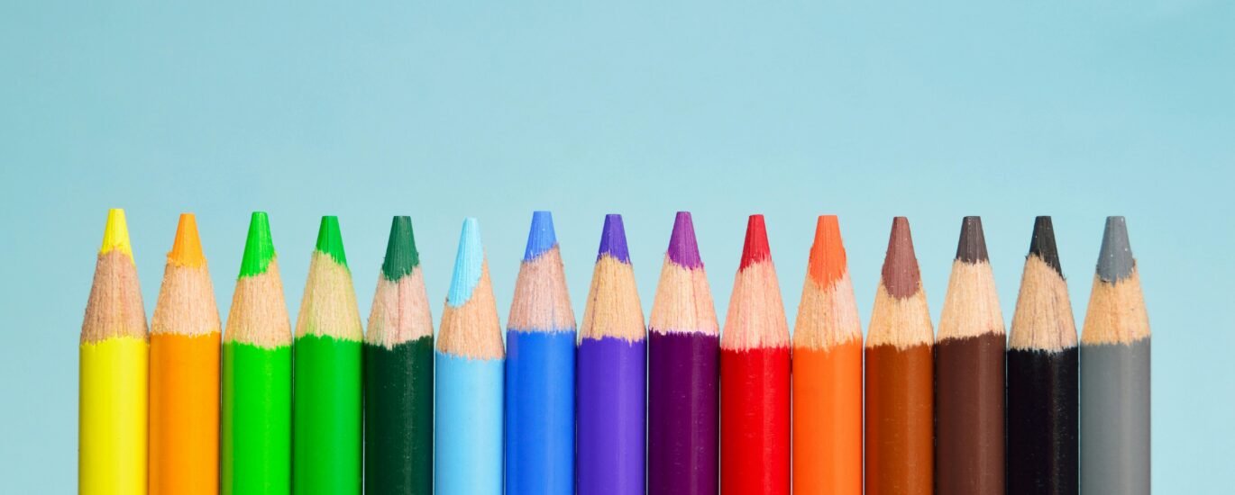
The Psychology of Color in Branding: What Your Palette Says About You
When you think of Coca-Cola, what color comes to mind? How about Spotify or Tiffany & Co.? Chances are, you instantly visualized red, green, and that iconic robin’s egg blue—without even seeing the logos.
That’s the power of color psychology in branding.
In a world saturated with visual content, color isn’t just a design choice—it’s a strategic branding tool. The right palette can influence perception, spark emotion, and drive action. The wrong one? It can confuse your audience and dilute your message.
In this guide, we’ll break down how color influences brand identity and what your choices say about your business.
Why Color Psychology Matters in Branding
Color triggers emotional and psychological responses, often on a subconscious level. Studies show that color increases brand recognition by up to 80%, and 62–90% of snap judgments about a product can be based on color alone.
In branding, color works to:
- 🔥 Evoke emotion
- 🧠 Shape perceptions
- 💬 Communicate values
- 🎯 Influence buying decisions
A carefully curated color palette can instantly signal whether your brand is bold or minimalist, fun or serious, traditional or modern.
What Different Colors Say About Your Brand
🔴 Red – Passion, Energy, Urgency
Red is powerful. It grabs attention, stimulates appetite, and creates a sense of excitement and urgency.
Great for: Food brands, sales promotions, fitness, and lifestyle products.
Brands that use it well: Coca-Cola, Netflix, YouTube
Red says: “Look at me. I’m bold, energetic, and action-oriented.”
🟡 Yellow – Optimism, Warmth, Clarity
Yellow radiates happiness and positivity. It can spark curiosity and friendliness when used in the right balance.
Great for: Child-focused brands, innovation, hospitality, and creative services.
Brands that use it well: McDonald’s, IKEA, Snapchat
Yellow says: “I’m joyful, approachable, and full of life.”
🔵 Blue – Trust, Stability, Professionalism
Blue is calm, secure, and intelligent. It’s widely used by tech companies and financial institutions to build trust.
Great for: Finance, tech, healthcare, education
Brands that use it well: Facebook, PayPal, IBM, Intel
Blue says: “You can trust me. I’m smart, safe, and reliable.”
🟢 Green – Growth, Health, Balance
Green is associated with nature, sustainability, and wellness. It also conveys balance and prosperity.
Great for: Eco-brands, wellness, food and agriculture, finance
Brands that use it well: Whole Foods, Spotify, Starbucks
Green says: “I care about growth, balance, and the planet.”
⚫ Black – Luxury, Sophistication, Power
Black is sleek and strong. It’s often used in high-end or minimalist branding to communicate exclusivity.
Great for: Luxury fashion, cosmetics, premium services
Brands that use it well: Chanel, Nike, Apple (product packaging)
Black says: “I’m elite, timeless, and confident.”
🟣 Purple – Creativity, Royalty, Wisdom
Purple combines the calm of blue and the energy of red. It feels imaginative and prestigious.
Great for: Beauty, tech, wellness, education, and creative brands
Brands that use it well: Cadbury, Yahoo, Twitch
Purple says: “I’m creative, thoughtful, and just a little mysterious.”
🟠 Orange – Friendliness, Confidence, Fun
Orange is energetic and cheerful. It’s less aggressive than red but still bold and inviting.
Great for: Startups, food and beverage, youth-focused brands
Brands that use it well: Fanta, SoundCloud, HubSpot
Orange says: “I’m approachable, bold, and always up for something new.”
How to Choose the Right Brand Colors
Your brand’s color palette should align with your:
- Target audience – What do they resonate with?
- Industry standards – Are there colors you should follow or avoid?
- Brand personality – Are you playful, bold, calm, or rebellious?
- Brand values – What do you stand for, and what emotion do you want to evoke?
🧭 Start with your core color (usually the main one in your logo), then build a palette of accent colors, neutrals, and interactive colors (e.g., for buttons, links).
InkframeCo’s Quick Tips for Color Consistency
- 🎨 Use color codes (HEX, RGB, CMYK) across all platforms
- 💻 Set brand colors in your design tools and web stylesheets
- 📘 Include color usage rules in your brand guidelines
- 🌈 Use no more than 3–5 core colors to maintain visual harmony
Final Thoughts
Your brand’s color palette is more than a visual tool—it’s an emotional cue, a signal of your values, and a key piece of your identity.
Whether you’re starting fresh or rebranding, don’t pick colors just because they “look nice.” Choose them because they mean something—to you, and more importantly, to your audience.
At InkframeCo, we help businesses create purposeful brands through strategy-driven design, including color systems that resonate and convert.
🎨 Ready to find your brand’s true colors?
Let’s build a palette that works across every touchpoint. Reach out to us at contact@inkframeco.com.
✨ Bonus: Free Resource
Want a cheat sheet of color meanings and combinations?
Follow us on Instagram for a free cheatsheet .